Geiger
Modernize a legacy furniture brand’s web presence to deliver real results that drive traffic and improve the site experience.
Role: Content Strategist, Information Architect

We began the project with a design sprint, diving deep into the site by conducting stakeholder interviews, ideating on solutions to problems we discovered, and testing with real users.
During the sprint, we discovered that stakeholders weren’t happy that the site wasn’t responsive, was difficult to update, and had outdated content. Users wanted to easily access things like dimensions, product options, images for client presentations, and price books. For the rest of the project, we made sure we we’d prioritize these issues during our design, development, and content creation processes.

The existing product taxonomy didn’t give a good overview of the Geiger offer and made the navigation difficult to use. We immediately identified this as a valuable opportunity for the brand.
At the beginning of the project, I did competitive benchmarking to discover how other manufacturers in the same furniture category were organizing their products and what labels were commonly being used to name these groupings.
Based on that benchmarking and the shape of Geiger’s offer, I recommended a reorganization of their product taxonomy and a redesign of the navigation, resulting in a much more intuitive browse-and-find experience.

Marketing copy on the old site was written with an “inside out” mentality, thinking first about what the brand wants to say and not about what the user wants to read.
By listening to our users first, we discovered that they wanted bite-size nuggets of information about the product that they could easily pull into their presentations and recall while meeting with their clients.
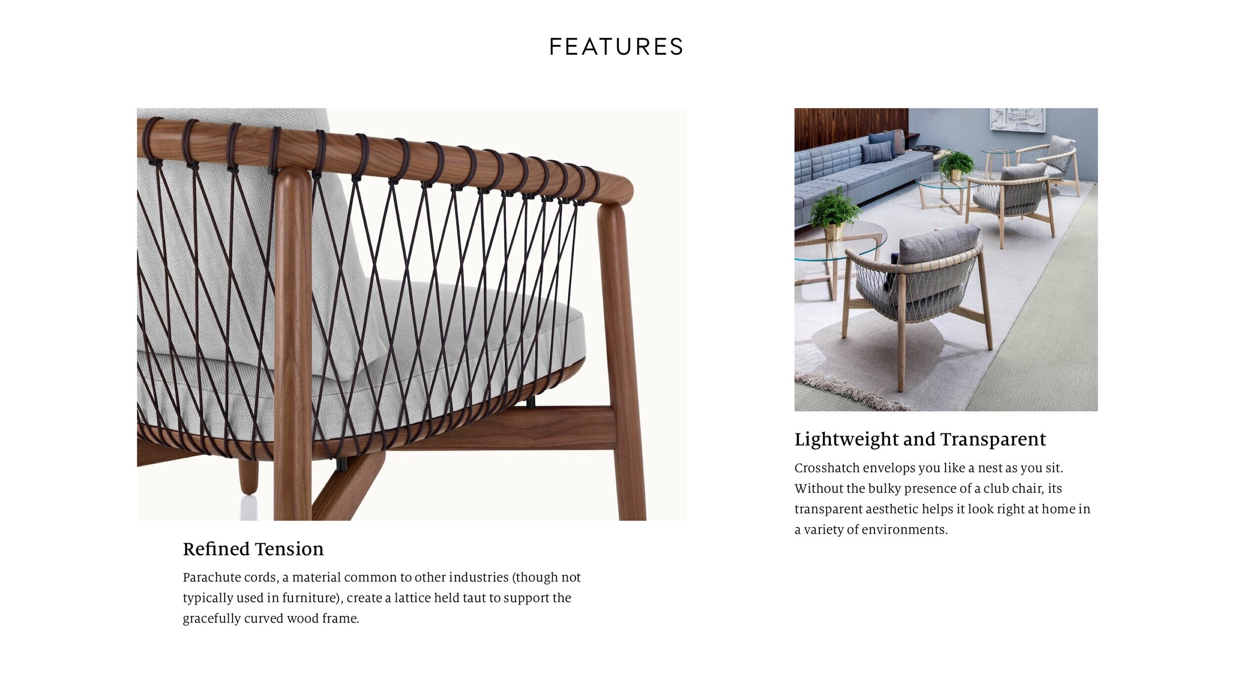
I worked with the Geiger team to break up and rewrite the existing long marketing copy into clear value propositions for each product, and gave priority to explaining a product’s features and options clearly and succinctly.


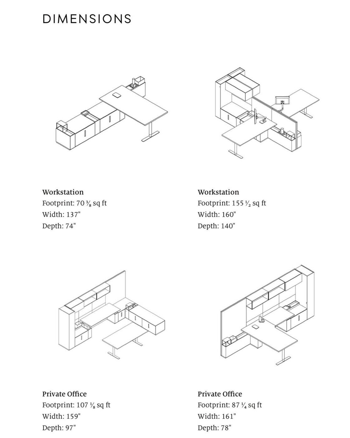
A key piece of content our users consistently asked for was dimensions.
In the early stages of the specification process, architects and designers want easy access to basic product dimensions so they can decide whether a product they’re considering will even remotely work in their project. They do this to rapidly winnow down the options they’re considering for client presentations.
Because of how critical this information is to their journey, we gave dimensions and dimensional drawings the highest position on the Specs pages of all Geiger products, even complicated casegoods products.

Design resources were a constraint of the project. We couldn’t afford to pull designers off other initiatives to mock up product pages for the authors working in the CMS.
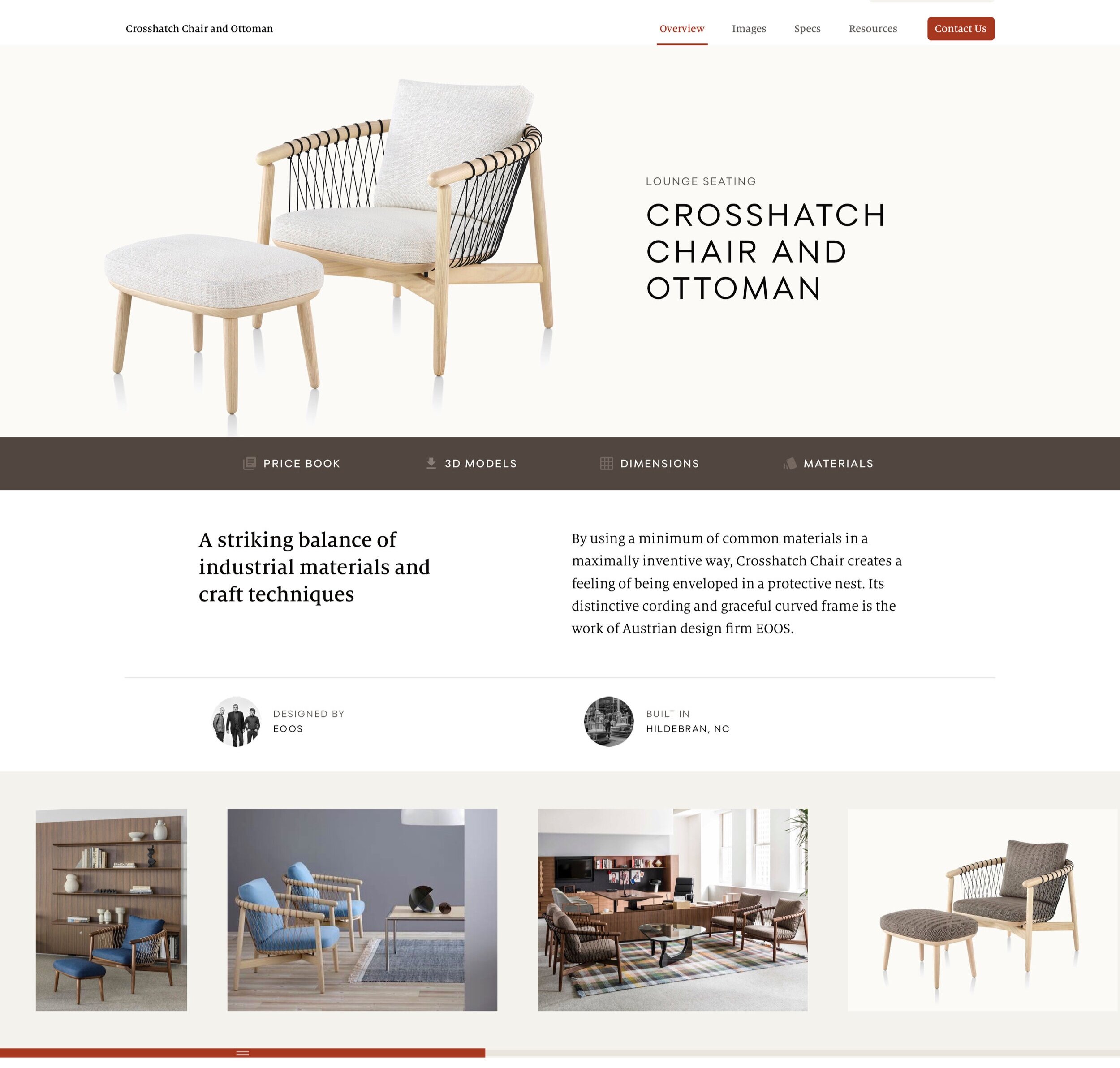
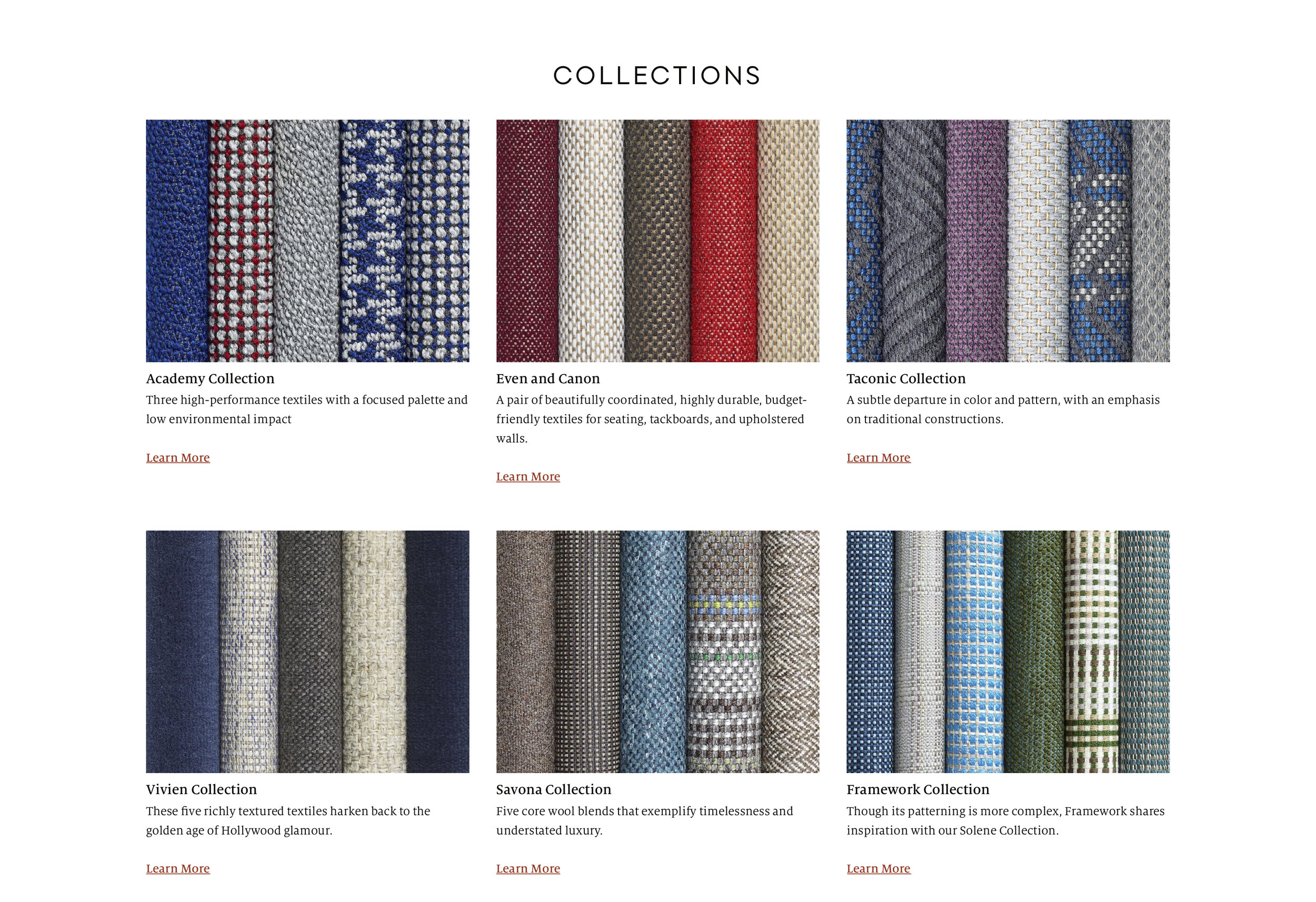
To get around this issue, we settled on a highly modular, but rigid system of templates for various page types including product pages, category and subcategory pages, and textile collection pages.
We then mirrored the max cases of these pages in a tool called GatherContent, and had the writers deliver copy and design team deliver image selects to the content authoring team through that tool.
As a result, the build phase went very smoothly, content authors had few questions as they were building pages, and we were able to stand up an entire site full of new, rich content using only a handful of mockups as our guides.

The resulting site saw a significant increase in organic traffic after launch.
On the site, users were demonstrably more able to complete their tasks, the amount of negative site feedback went down even as site traffic went up, and the overall NPS score went up.